Community

Learn how geospatial big data can help close the digital equity divide and accelerate enabling digital equity.

Learn how telecom industry experts leverage the latest accelerated network data analytics tools to optimize networks & gain an advantage over the competition.

Learn the top 7 ways to optimize customer retention in the telecom industry with different strategies your company can implement to improve customer satisfaction.

The benefits that 5G promises to deliver can only be fully realized by leveraging the latest in RF propagation solutions.

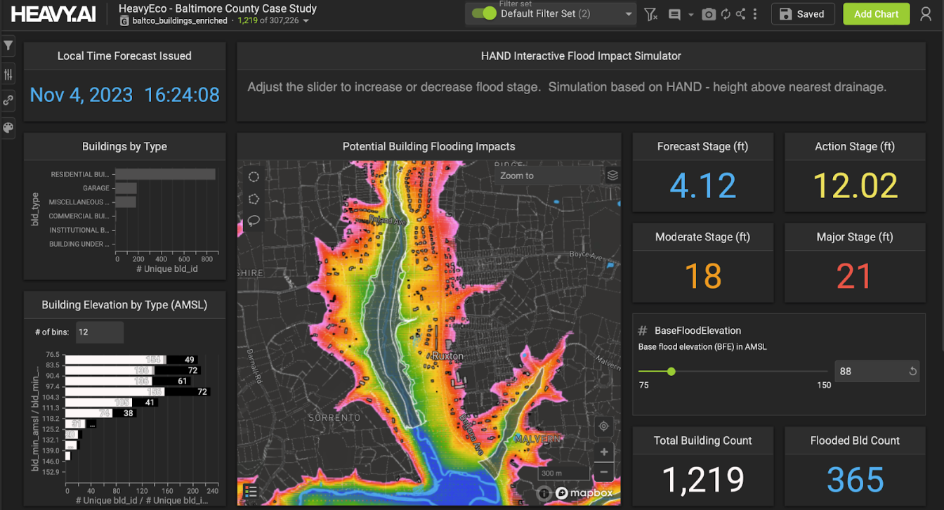
Discover how HEAVY.AI tools are advancing Earth analytics and accelerating critical, time-sensitive decisions that can help mitigate natural disasters.

To solve the industry's most significant challenges, industry leaders leverage the latest geospatial enterprise solutions for telecoms by HEAVY.AI.

Learn how big data in weather patterns can help predict the future of climate change and give insights as to how we can respond to it now.

Learn about the latest climate data analysis tools and how they can help us understand the full story of our relationship with the planet.

Opportunities for investing in the energy sector are booming. Find out how energy business intelligence informs energy investments.

Energy data analytics is helping investors navigate the growing variety of energy assets. Find out how energy analytics is driving market expansion.


