Community

In this post, we'll review the HEAVY.AI Free offerings on the AWS and Azure Marketplaces and show you how to get started with video tutorials that showcase deployments that take ten minutes or less!

How do we take full advantage of the enormous quantities of data streaming around us every day? The key is visualization. Big data visualizations help raw data tell a story that humans can understand and learn from.

OmniSci harnesses NVIDIA-Certified Systems for big data geospatial analysis and visualization to help agencies tackle the nation’s big challenges in real-time
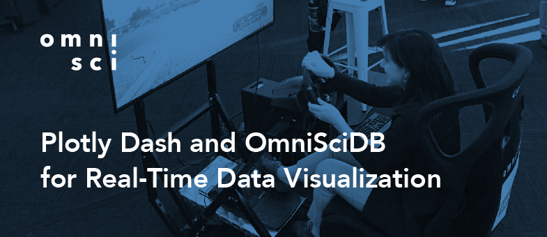
OmniSci Immerse provides self-refreshing dashboard functionality, but sometimes you need the ultimate flexibility of a custom app. Here’s how to use Plotly Python, Dash by Plotly and OmniSciDB to create a Plotly real-time data dashboard.

Getting started with OmniSci’s Charting Libraries has never been simpler. Read this blog post to learn how to create an interactive visualization from our provided example project on GitHub.

Every day, people tell us that they love MapD. And we love all of those people. We’re proud to consider all of them part of our community.

Investigate American opioid crisis data with a fully interactive, visual analytical experience

We are hard at work on our roadmap for next year, including OmniSci 5.0—we have a lot of exciting capabilities that will make OmniSci the ideal platform when you need both interactivity and scale to underpin any sort of insight you wish to derive from data.

It’s important for companies to acknowledge and validate the phases of life that every employee passes through, via corporate policies, workplace culture, and personal interactions.