
Bureaucracy in visual BI solutions is inefficient and downright uninspiring. Learn how decision makers interacting directly with data can empower insightful analysis.

In our final part of this three-part blog series, we explore how we created the charts, maps, and dashboards in Heavy Immerse.
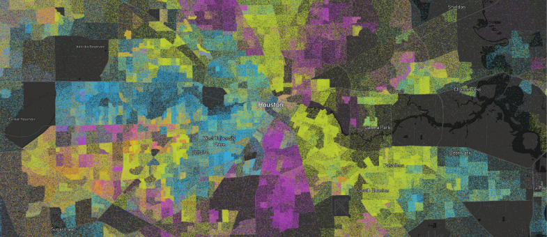
Last week we released our newest public demonstration that takes demographic dot density maps one step further by mapping data from the 1990, 2000, 2010, and 2020 censuses. In this post we discuss how we acquired the data for each census and the Python notebooks used to turn the census block group polygons into individual points.

In this post we took demographic dot density maps one step further by creating a set of Dot Density Dashboards that view over a billion census data points in real-time.

The next generation of BI promises automated tools that anyone can use to unlock the power of augmented business analytics. Get our take on the future of business intelligence.

Learn how to maximize the potential of your business intelligence (BI) dashboard by adhering to these tips and best practices
We are incredibly excited to announce HEAVY.AI Version 5.8, a release that ushers in foundational changes to HEAVY.AI's rendering engine, introduces new database functionality, geospatial operators, and system administration tools.

This tutorial will focus on how to load datasets into HEAVY.AI using the Secure Copy Protocol (SCP) and the COPY FROM SQL command.

The following tutorial will use HEAVY.AI's JupyterLab integration and Immerse to ingest, analyze, and visualize GHCN data.

Climate change is triggering environmental events that are growing in severity and frequency. Learn how real-time environmental monitoring systems and data science can reduce our impact on the environment.